Monday, 15 December 2014

Creating A Navigation Bar


This is the final result for a navigation bar. It can now when hovered over contrast to a lighter colour, to do this I clicked the button, then went to properties, and changed the brightness.


This is just the pop up you get to test it, by going on the Flash CC navigation Bar "Control" then to click on the test option.

Here's how you do the whole thing:

First make a button this will involve creating the shape you want, this can be done by selecting the rectangle tool. Then change the colour I chose a blue, blackish texture. Then convert to symbol- naming it "Navigation Button" which you then select button for type. Convert to symbol the second time only this time naming it "Navigation Movie" and choosing movie clip as the type. Select the button then go over to the up state, clicking it while pressing alt, and dragging it to hit. Now do the same for the over state. Click on the button going to properties, in there go to colour effect, then to style. This should have a brightness box, click this, bear in mind your on the over state, and change to 30%, now click hit state, and do the same changing the brightness to 64%. Now rename the layer 1- "Navigation Home". Create a new layer naming this "Text", and on that layer click the text tool, and type "Home". Make sure to choose a suitable colour for this.

After this stay on text layer, go on to the up state, while clicking, and pressing alt drag to the hit state. Go to the original page, and create 3 new layers name the first or bottom  layer "Navigation Home", the second one "Navigation Clients", third one "Navigation Services", and the fourth one "Navigation Contact Us". Now lock the Navigation Home layer, then click on the Navigation Clients, then go to the library clicking on the button you made, and duplicate naming this "Navigation Clients", and once this is created drag from the library next to the other button. Edit the text naming it "Client" aligning it so it looks good. Now repeat the same step for all of these locking the layer, and duplicating it naming it the one you locked.

Finally you need to match the canvas to the navigation bar to do this you need to gather the width, and height, and then go to modify, then document, and change the height, and x to the info you gathered so it matches, and your done.

Monday, 8 December 2014

Picking final design for poster

I worked on my final design for my poster which will be representing my shop. I chose a clown because that's what most people relate to when they think of a joke shop, and it's universally identifiable with comedy. I made it very colourful to catch the eye of my viewer. While I have chosen this as my poster, this wont be my logo. To make this I scanned it used the selection tools, then copied it to a new page in photoshop. For the design I kept the colour of the original drawing and just edited the text. Using a contrast of size, shape, and colour.

Monday, 1 December 2014

Flash C6


For my first activity I created a page in Flash CC with the size width being 700, and the height being 300 pixels. Then I changed the workspace to animator. Then I created a blue rectangle covering the whole workspace, I changed the colour using the bucket tool. Below you see a screenshot of my Flash tools, and one of my flash page.
After creating a blue rectangle I added text, and made it bigger, by changing the width and height of the box the text box, and then finishing it off by changing the size the of the text. All these tools can be located on the right.
Then to animate it I created two layers named layer 1 text, and layer two background. then in layer one I added text which I then dragged it above the stage, and created a motion tween by clicking in on the black dot, then I dragged it to where I wanted to it to go. To slow it down all I did was increase to 25- 48 frames. I wanted to change the background from white to a more interesting background colour so to do this I unlocked the background layer or layer 2, and dragged the back dot to the number of frames I chose. Then to complete my animation it is only a shop if it has a logo even though my teacher wasn't specific about what to draw I drew a apple on Photoshop using the paint brush tool which I then copy and pasted to Flash CC. After I converted it to a symbol. Then to test my movie I then created a swift file by clicking command+return/enter.

From this I have learned how to animated text, and how to add a separate thing like a drawing together on  Flash CC.


Workspace
Tools


Motion tween final touch
Animation now with background colour

Monday, 24 November 2014

Banner, T-shirt, and Bags


This goes along with my logo and poster ideas, these are banners I have designed. Being that my joke shop is fun themed I chose to make it colourful and playful in whatever way I can whether hat be tilting the words, shrinking or increasing the size so it looks appealing to a younger audience.


These are T-shirt designs. The first one is simply a print lettered "Pranks In A" then with a box with a punching glove coming out. The second one is the word "Prank" going downward then the word "IN" is in bubbled writing to emphasize the fact that there is pranks in a box. After that I added a box where the O should be in box.


I found this hard-designing the bags because I then had to think about the size of my products, and if my product is size matched with a workers tool set or the size of a red nose. After overcoming this I followed through with same boxing glove coming out of a box idea. I'd like to say I'm not happy with the name of the shop, because it shows it self to be boring, and spawn bown ideas.


Monday, 17 November 2014


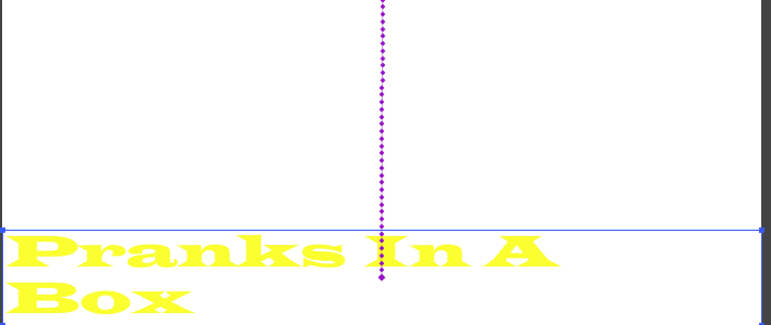
For my logo design I decided to use the name (Pranks In Box) as a guideline, and follow it exactly. There's is not much I've done- basically just added a box and made it look like the words "Pranks In" are coming from inside a box. My original idea was to have a bunch of prank toys falling out with the box tipped over and on its side, but this just seemed simpler, and easy to understand.

Monday, 10 November 2014

Ideas For Joke Shop


Some logo ideas I did ignore the The Simpsons logo. As the product's name is "House of Fun" the logo had to revolve around a house. The first one is the top of the roof not easily recognizable at first, so I added a chimney. The second one I decided to do something simple so I just did bubble writing with a house. Then did quick sketches of what we wanted our posters and flyer to look like.
Posters


Front Flyer

Back Flyer

Monday, 3 November 2014

Project Ideas For Joke Shop

This morning as a group we brainstormed the names for our shop centred around the joke theme. Then we researched on the internet logos, products, and shop fronts for the store we make.

Monday, 20 October 2014

20/10/14


For this I animated a banner in Photoshop. To do this a series of steps were taken this involved creating new layers, creating classic tweens and many other steps, but I've managed to to create a simple step it goes keyframe-movement-classic tween, this is the overall process for a simple animation.

This was simply creating a button on Flash C6. To do this you go insert-new symbol, and while on this option select the button from movie clip, then you'll need to give your button a shape this is called a hit area for this I chose a circle. Now that circle needs a colour so I just left it white, but when hovered over, note this is labeled as "over" on top of the screen as well as "down" for when it is clicked, and "hit" for the area it covers. As I was saying when hovered over or "down it needs to change colour- for this I chose red. and when clicked (down) I chose green, and left it green for hit.

Monday, 13 October 2014


             Animating a Objects

Create a shape, but not after adjusting the size which is 728 by 90. then click the shape and enter the same coordinates that you did for the size only this will be for width and height .
Next is to modify and convert to symbol, then lock the layer, and create a new layer, this should say layer 2.
Move it to where you want it to go as long as its on stage then click on a number of frames you want do this for both layers.
Following that move your object to where you want it to go, after that control click, and create classic tween.

Monday, 6 October 2014


To do this I placed the image into Illustrator removing the background with the quick selection tool. Then saved it as a psd file so when you place it in Illustrator the background's gone, and it's as white as you see here.

 Then I rasterized it as you can see from the image on the right and changed the resolution to 20 instead of 300 which it is normally set to.

Rasterizing it pixelates on how much  depending on the resolution.

Monday, 29 September 2014

The  cover for my magazine.

Creating A Compound Path

First I made 3 circles each with different colours, then I put 1 smaller circle in each of them. I pushed the command key+ 8 to create a compound path. The result was white circle gaps.

I clicked pathfinder then divided them which grouped the circles so I could apply technical  details to it like colour change on a certain area of the shape, which in my case was to intercept it to make it look something like the Olympic logo.

I was asked to make an eye in Illustrator. To do this I created the two shapes then made a clipping path  by pressing command + 7.

Then had to group the whole thing. And for the fun of it added other facial features.

Monday, 22 September 2014

animated horse gif


You can't see it but its a reverse gif I made in Photoshop with horse galloping. It was a sequence with the horse going forward, and I just reversed it, and experimented with the art gallery.

Monday, 15 September 2014

A3 Portrait Illustrator


Outline of my body.

Colour Swatches Illustrator


    This was me experimenting with the colour swatches.

Photoshop Tools


This is some of the name selection tools I used, showing their uses and what it's good for, and what it's bad for.